
Run Chart
What is it?
A run chart is a way of displaying data over time. A run chart differs from a line graph because it has an additional line showing the median (middle value).
Why use it?
A run chart will help you to understand what is normal for your current processes or systems, including variation (and whether this is random or non-random). Once you start making changes, a run chart will help you to understand if these are having the desired effect. By annotating important events or changes on your run chart you can use it to ‘tell an improvement story’.
How to use it?
You should have at least 10-12 data points for a run chart. Ideally you want these data points to include baseline data i.e. data before you make any changes as part of your improvement.
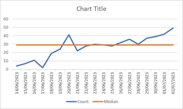
Run charts can be created using Microsoft Excel. To do this, you need to display your time intervals (e.g. daily, weekly, monthly) along with your count data (see image to the right). You then need to calculate your median.

You calculate your median by typing your formula into cell adjacent to your count data:
=Median(B2:B20)
In this example, B2:B20 is the range of cells that you want Excel to use, yours will likely be different to this. The cell range should be highlighted blue when you type your median formula in, so check that the correct cells are selected. Excel will then calculate your median (29 in this example). You then need to make sure that the median value is populated next to each count value, as shown below.
Once you have done this, you can generate your run chart. Highlight all of the cells that you have populated and navigate to “Insert” from the toolbar at the top. Go along to the graph section and select the first option under “line graph”. This should automatically generate a run chart like the one below. Add your title and you’re all done!

If you have enough baseline data, you can do something called ‘freezing and extending the median’. You can only do this if you have a stable baseline, but this will help you to see if your changes are having an impact faster. Learn more about this and run charts in general here.
If you’re not feeling very confident with Excel, contact the QI team to request help with this.
Once you have a graph, you can apply the run chart rules to see if your data shows any non-random variation. These are:
A trend (5 or more points in the same direction)
A shift (6 or more points on one side of the median)
More, or fewer, runs than would be expected
An astronomical data point.
Learn more about run chart rules here Measurement 1 Run Chart Rules | Turas | Learn (nhs.scot)
More information
Quality Improvement Zone NES - click for a different way of explaining what a run chart is and how this tool can be used.
IHI - click for more information explaining what a run chart is and how this tool can be used.
NHS England - click for more information about run charts.